Fibreside Chat Andrea Rangel – P. 1
November 15th, 2023 • Blog • 2
Always fascinated with the variety of creative paths one can follow, we started to ask our collaborators, to share their experiences on our blog.
We are delighted to host this special blog post series with knitwear designer, Andrea Rangel. Andrea is the author of two fantastic stitch dictionaries and we asked her a few questions about choosing colours for colourwork project to share with you.
After choosing the right yarn, choosing colours is an important step when starting a colorwork project. This is not an easy skill to master when you are a beginner at colorwork knitting. How do you select your colour combinations for your projects?
Choosing colours is a very personal process and my first priority is to find a combination that suits the mood for the project and that brings joy.
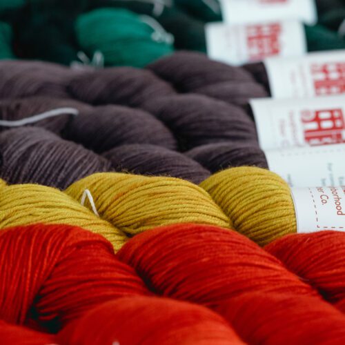
So step one is to take a quick look through the colours available and pick any that stand out, without being too particular on that first round.
It’s not about what’s in style, what my wardrobe needs, or picking colours that I think will go well together at this point, but rather going with a gut feeling of colours that are pleasing.
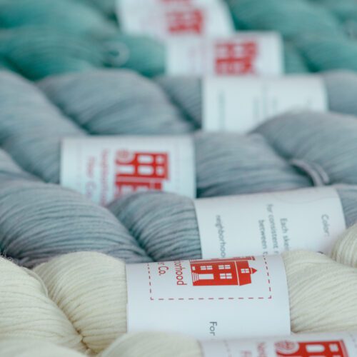
I usually pick colours from a computer screen rather than in person, but this works just as well in real life. I like to save the images of colours I like to my iPad so I can play with my options and if you’ve got actual yarn in front of you, like if you’re in a yarn shop, I suggest making a pile of the ones that excite you.
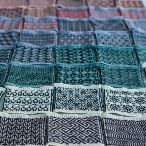
Once a pool of colour candidates is in place, it’s time to make some choices. Most of my designs and projects are just two colours, so I’m often looking for two colours that contrast well.
But if you want to have a whole palette, I suggest breaking it down first into 2-colour options.
Most of the time you’ll be working with just two colours at a time, so you need the colours that are worked in the same round to have good contrast with each other.
Once you have sets of those 2-colour combinations, you can start to combine them with other 2-colour combinations for a full palette if you want to work with a bunch of colours.
What are the important things to have in mind when putting colors together?
The 2 main things to keep in mind when putting colours together are:
One – Do you like it? Two -Do the colours have enough contrast that they stand out from one another?
The first is completely subjective and I encourage you to go with what feels right to you, regardless of what you think other people might feel about it.
The second is trickier than you might think, but there’s an easy test that can help before you even cast on for your swatch. More on that in a minute.
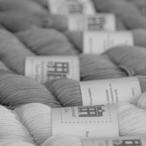
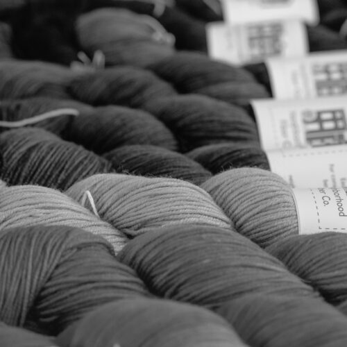
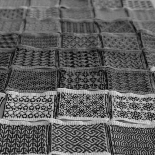
For the pattern to really stand out, pick one very dark colour and one very light one. What matters here is not the shade of the yarn, like red, orange, or blue, but how light or dark it is.
That’s called colour value and it’s what will determine how much your pattern will stand out from the background.
If both colours are very light or very dark, the pattern won’t show at all. If one colour is very light and one is medium value, you’ll get a visible pattern that’s more gentle, less popping, same with if you have one colour of medium value and one very dark. The closer the shades are to each other, the less the pattern will show.
But value can be difficult to distinguish, so here’s a trick to easily discern if one yarn is light, medium, or dark compared to another. Just look at them together in black-and-white!
If you’ve got images saved on your phone or tablet, make copies (being sure you know which one is which) and edit the copies with a black-and-white filter. Or, if you’ve got yarn in front of you, take photos of your possible combinations either in black-and-white, or edit them after to make them black-and-white.
The more different your two yarns are in black-and-white, the more likely your pattern is to stand out against the background. If they both look like the exact same grey, the pattern will probably get lost, even if the shades are very different from each other.
I had this happen with a light grey and a neon green. They looked nothing alike in the skeins, but the values were so similar that the pattern almost disappeared.
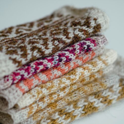
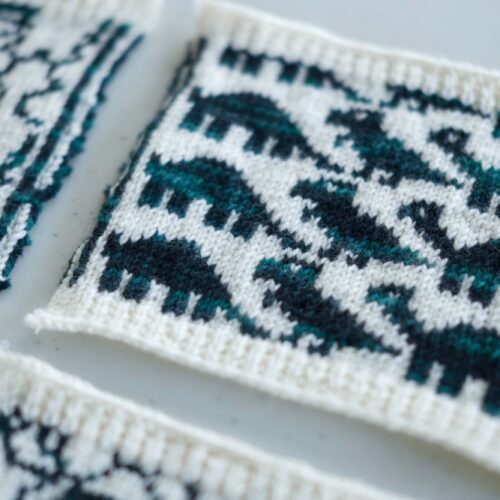
One more thing to consider is the motif itself. Are there delicate, single-stitch lines or mostly big sections of bold pattern? The more delicate your motif, the more important it will be for your colours to have a lot of contrast.
This is, of course, a matter of personal preference too. Do you want a soft, washed-out look? Or are you looking for a bold motif that will really show the pattern?
Thank you for sharing this fantastic blog post with us Andrea! You can read part 2 of this series here.
To follow Andrea wooly adventures find her on Facebook, Instagram, Twitter & Ravelry.